High Time

High Time for a new Blog. Still very much in lockdown but the chance of a week away shortly in a log cabin in the woods. Looking forward to it immensely.

In the meantime after seeing a post in FB asking for opinions as to whether an image should be black and white or left as colour. I started to think about the subject. Most of the participants chose black and white and I wondered why.

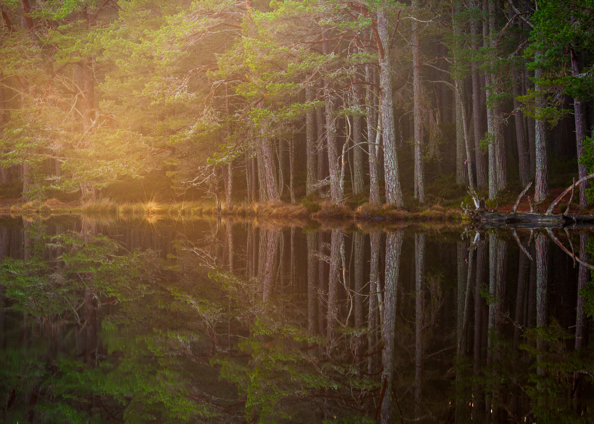
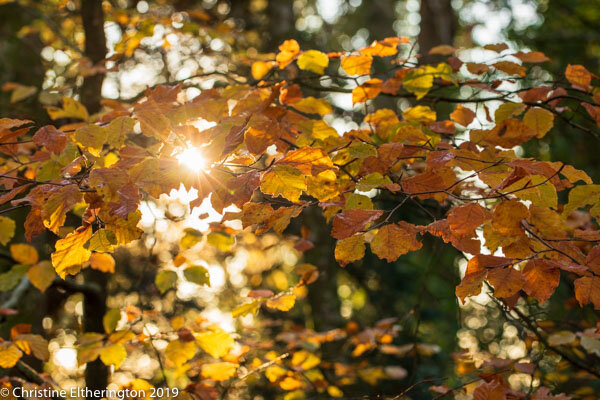
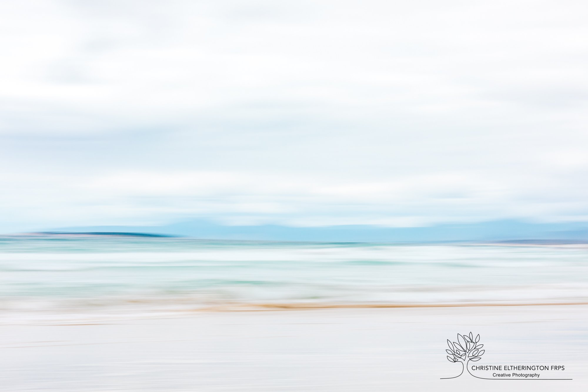
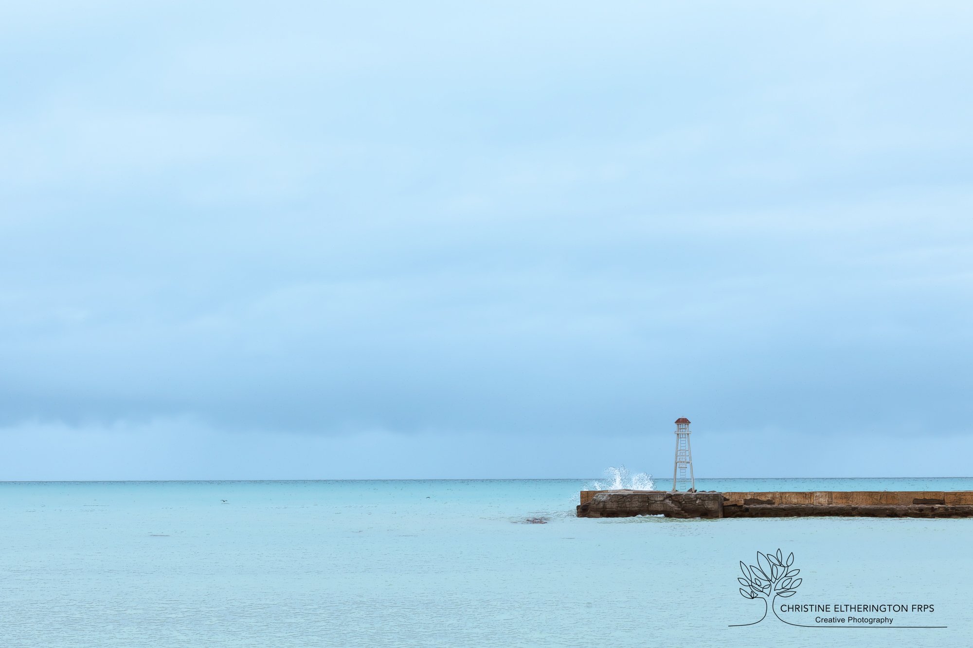
As humans we see the world in colour. (we would be rather upset if we could only see in black and white). But as photographers we seem to think that an image is improved when converted to black and white. Generally that is what it is - a conversion. Not so many of us are using black and white film these days. So why did so many people feel that the black and white version was the better. Is it because the popular view is that a photographer is a good photographer when their images are in black and white or is it because black and white improves an image.

My opinion is - a poor image is not improved just by converting it to black and white. It is still a poor image. Some images, and I would say very few images, can look outstanding in black and white. But the image has to be able to stand alone as a good image and converting to black and white only enhances what is already there.

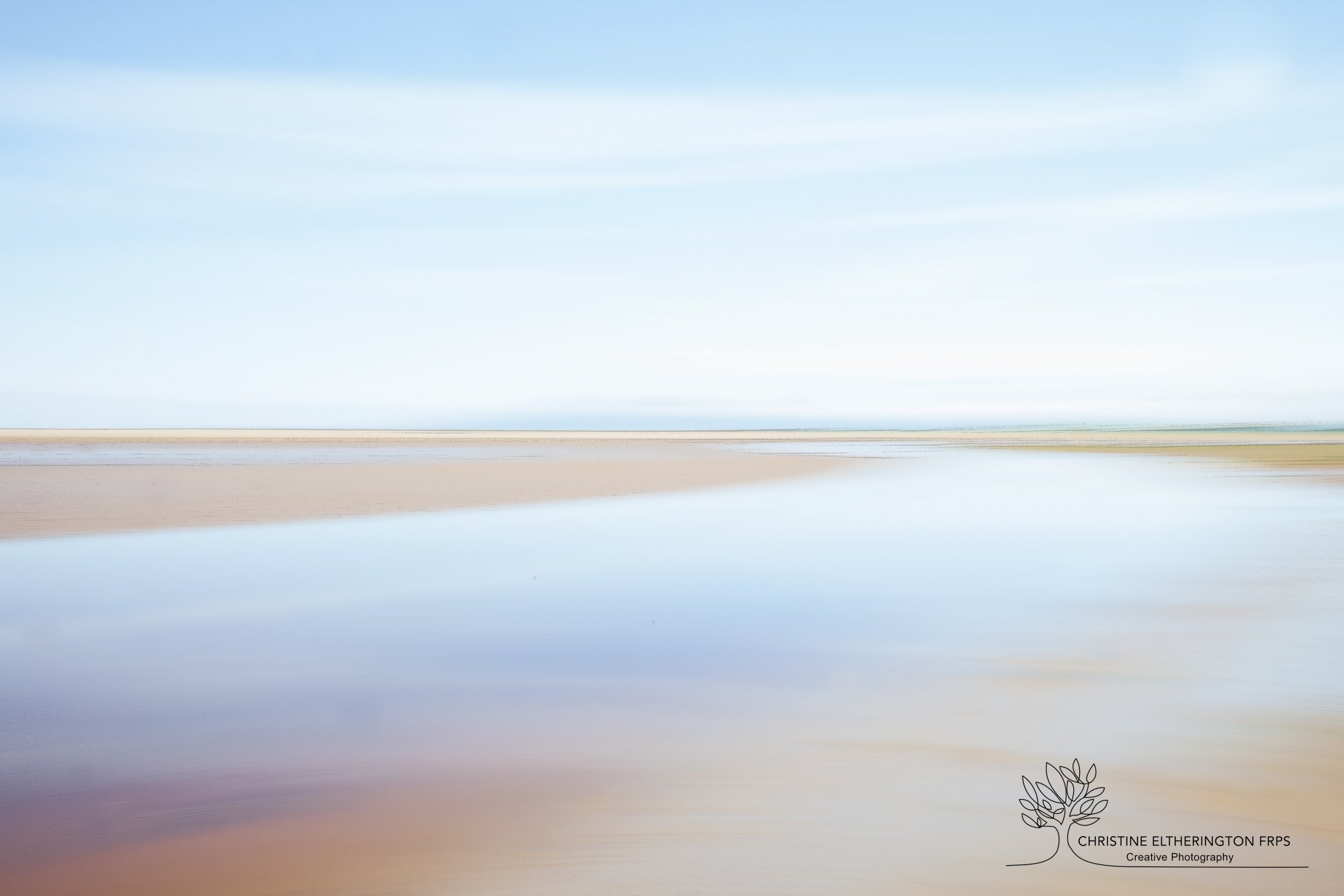
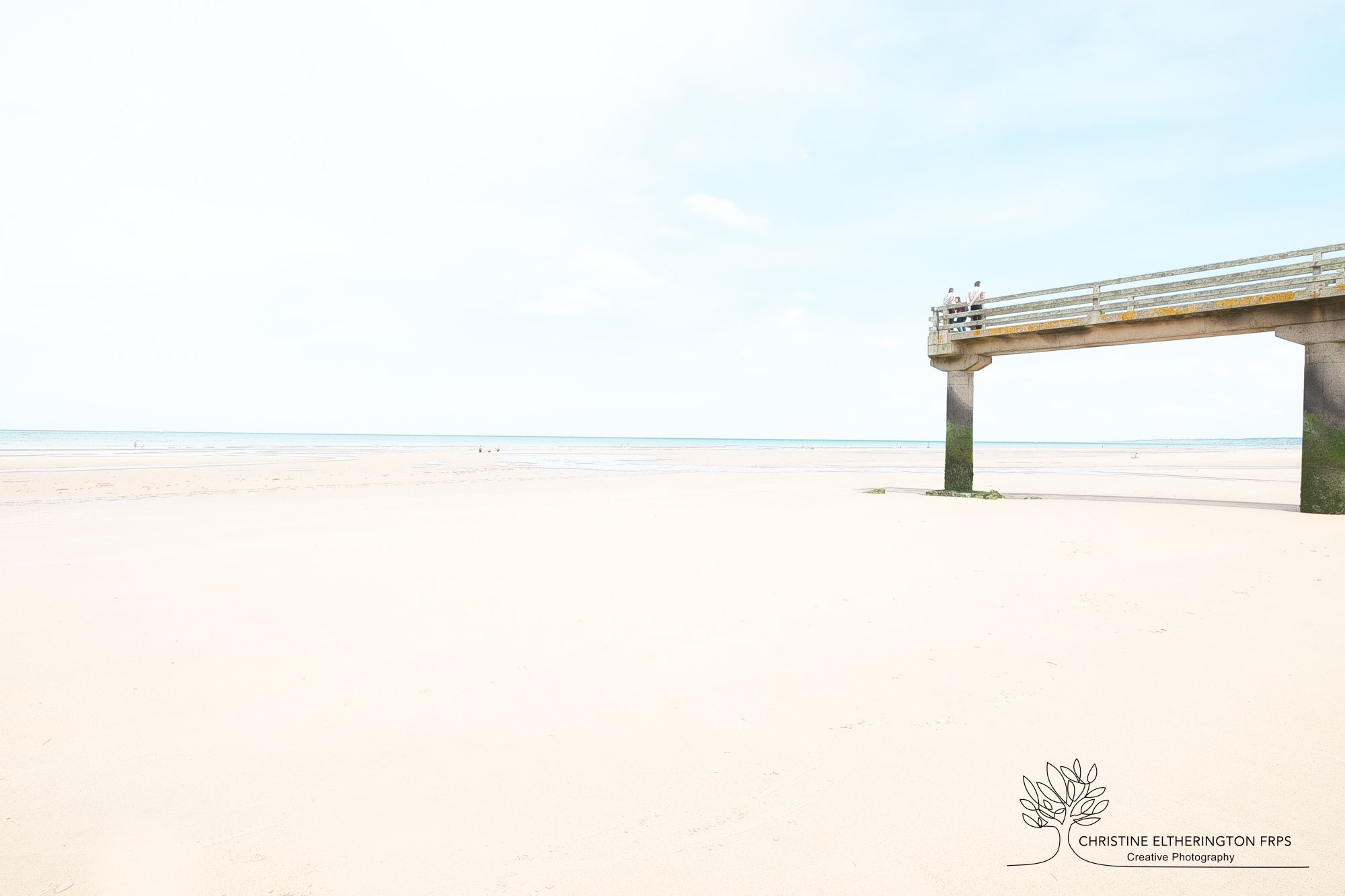
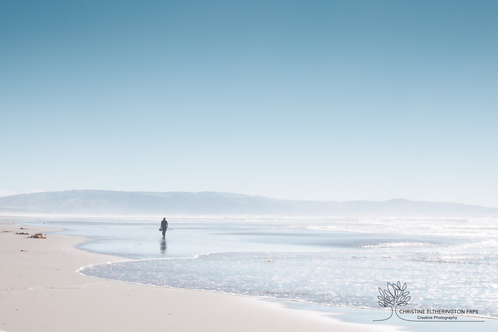
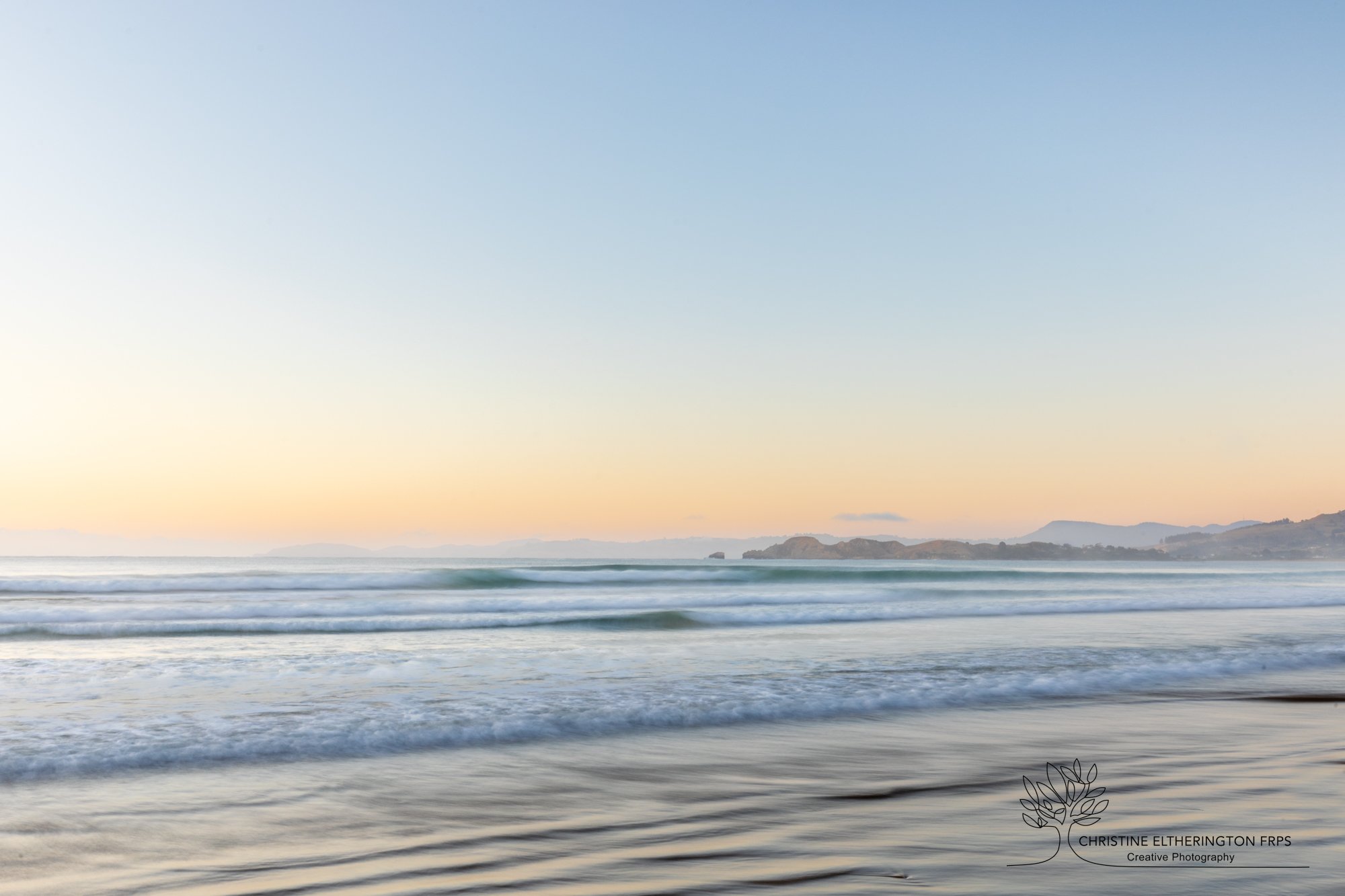
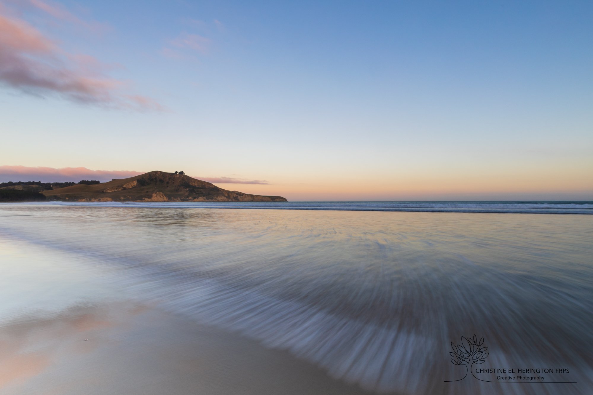
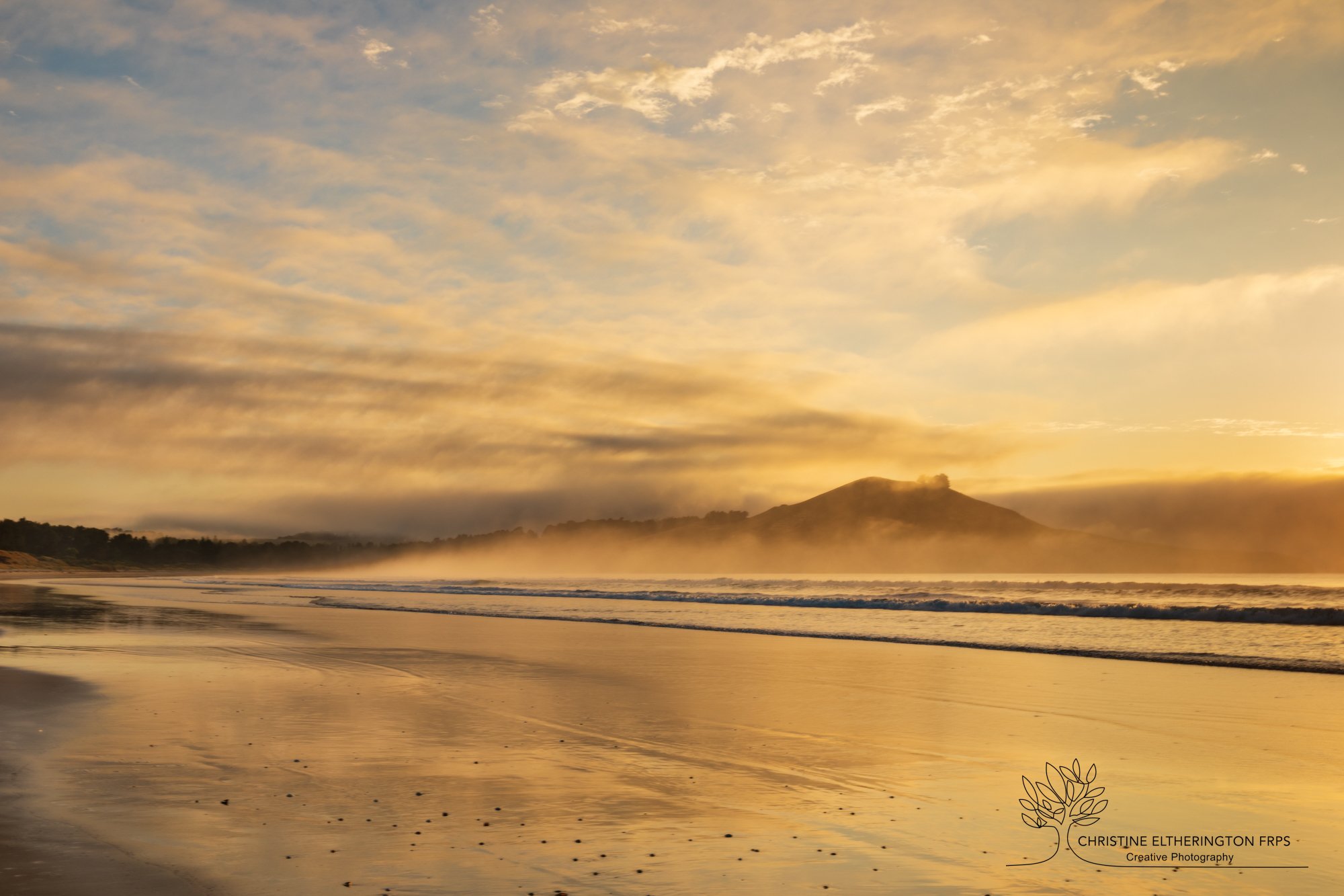
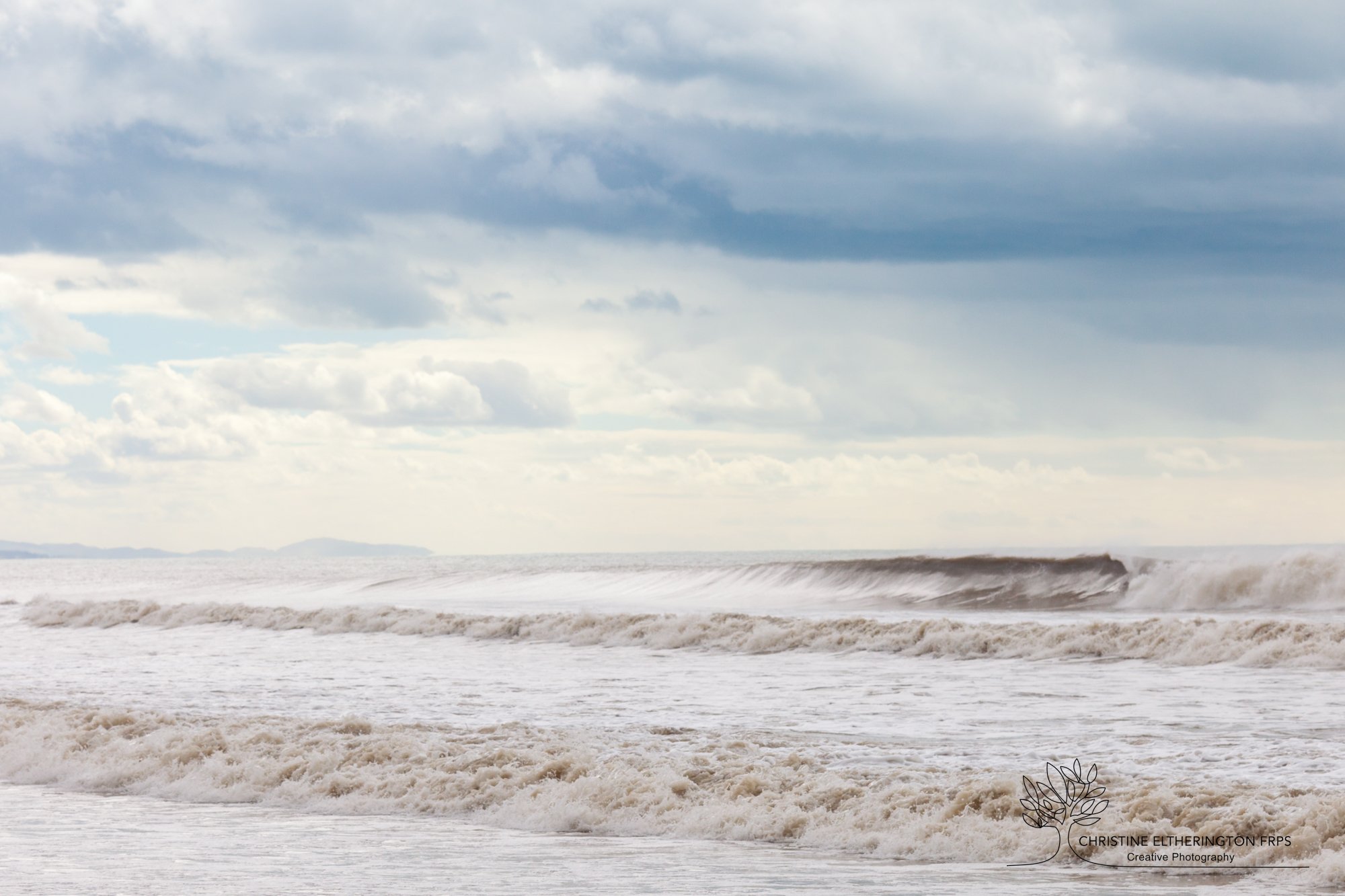
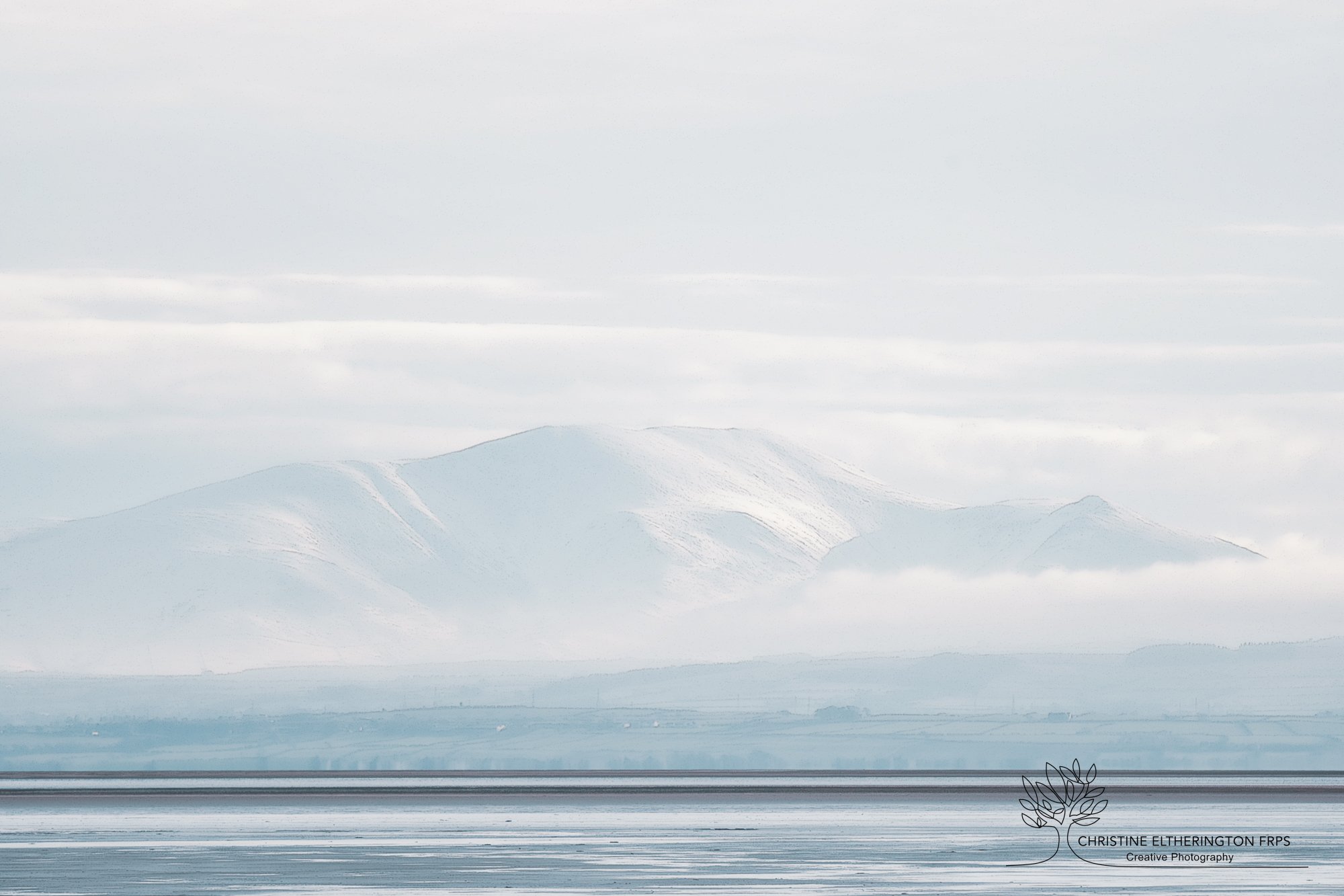
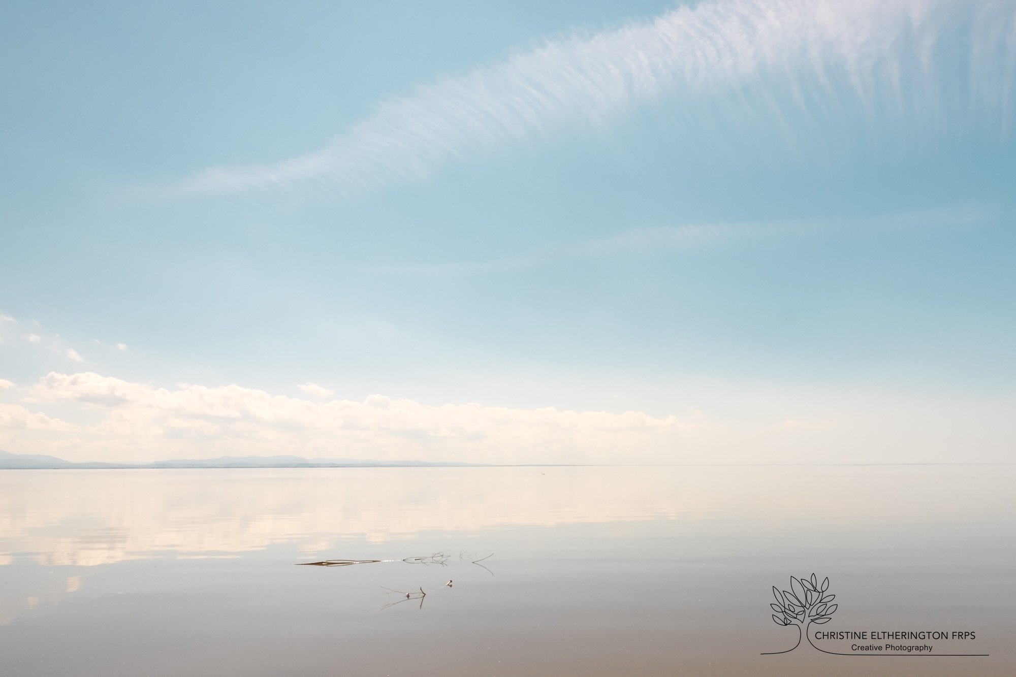
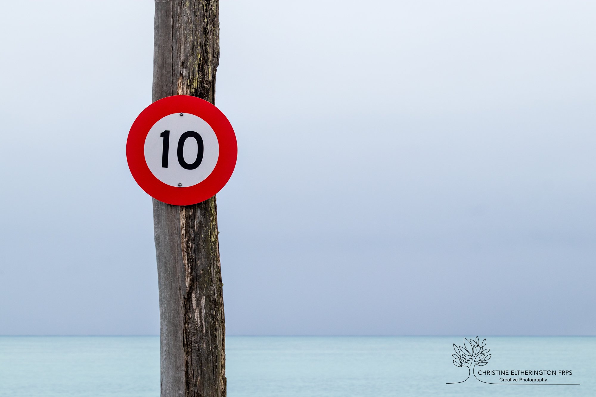
My personal preference is always colour even in poor weather conditions. What I miss with black and white is the subtle differences in colour created by light. I want the viewer to experience what I have seen and that is colour. In the end it all comes down to preference and I feel that should be personal preference and not what we think we should say.

What is your opinion?

As always just enjoy taking photos

Printing to File - Lightroom

Using Lightroom to print to file is a very simple way to ensure your facebook page or blog are pleasing to view. In Lightroom I like to create a triptych to portray a group of images. This way they are even sized and positioned on the page correctly.

In Lightroom go to the print option and choose print to fill-in the Print Job menu. Choose the setting of how many images in the group you want. In my case I choose 3 columns but you can choose as many as you wish. I then go up to the Image Settings and I choose zoom to fill. At this point you can move your image around in the blocks to position it how you want. Under layout I choose a small horizontal cell spacing of approximately .30cm. I just prefer a line in-between the images but you don’t have to. Set all other margins and sizes to zero and let Lightroom do the maths for you. When saving for social media file resolution of 100 ppl is more than enough.

Then print to file. Choose where you would like your image to be stored and it is ready to use on FB, Instagram, your blog or wherever.

fb livingroom.jpg

Star Burst and f16

Capturing starburst in photography is due to light diffraction. Diffraction is the slight bending of (light) waves around small obstacles and the spreading out of (light) waves pasing through or hitting a small opening. As light passes into your camera through a small opening, i.e. a small aperture at a low focal length, it bends around the edges of the blades and creates the “star” look. The number of rays from each starburst is related to the number of aperture blades in your lens.

The following two images were taken at different apertures. The first one is at f5.6. Nice but slightly wooly. The second one f 16, much more defined and crisp keeping the tails of the light in a nice ordered pattern.

It is another one of those like Marmite you either love it or you hate it.

But what every you do have fun trying it.

shambellie woods-4185.jpg
shambellie woods-4186.jpg

Hello, World!

In Camera Movement

In Camera Movement - Always a difficult one and for the purest amongst you a definite no no. But to me ICM has its place and can look stunning when carried out with care. I find some images look even better when using this technique than straight. It takes trial and error to get it looking good. It doesn’t work every time or in every subject mater. But it is worth giving it a go and enjoy your results

Snow Time

Snow Time

Royal Photographic Members Exhibition selection

On Saturday I attended the annual event held at Bridge of Allan for the Scottish Members exhibition selection. Each member takes four images and these are voted on to eventually end up with an exhibition of 40 members images. This then tours the region all the way from Shetland to the Scottish Borders. Great fun day. This is my image that was chosen.

Omarau Harbour. South Island New Zealand.

Omarau Harbour. South Island New Zealand.

Although an extremely simple image. It took quite some time to capture. The day was incredible still and grey. The harbour wall was just about the only colour beside the turquoise sea. I was just about to leave not absolutely satisfied with what I had got when a wave caught the harbour wall. That was it. Back again reset my camera and wait until the next wave came. I think it was worth it.

Christine

New Website

I am so pleased to have finished my new website. Hopefully it is a lot clearer and easier to navigate. I have really enjoyed creating it, clearing out some of the old images and bringing in the new.

Would love your comments.